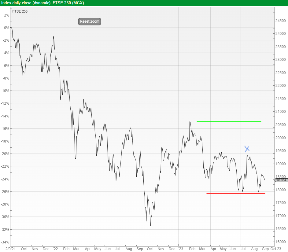
 Starting with the UK, Chart 1 is the FTSE 250 index since its peak in September 2021, since when it remains down 25%. The threat is even lower prices.
You can see the blue cross at the end of July, at which point we previously highlighted the possibility of this index breaking higher providing that 18400 wasn’t breached – which it did by mid-August. Then it fell to support at 18000 (red line), and if it now breaks down through 18000 it could head much lower.
As I write, 18000 is just 2% below this index today.
On the other hand, if it turns around and goes up through 20500, there might be some money to be made from that point, and we will update at that point.
Chart 1: FTSE 250 Since 2021 Peak
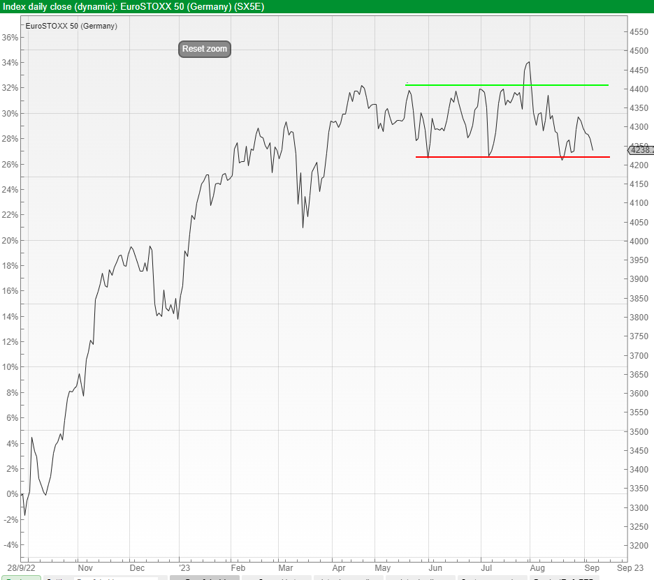
Next is Europe in the guise of the EuroSTOXX 50, shown in Chart 2 below since the September 2022 low. Support is at 4220 (red line), and a breach of this opens up the potential for considerably bigger losses. Breaking upwards through 4400 creates more positive possibilities.
Today this European index is less than 1% above support at 4220 – knife-edge.
Chart 2: EuroSTOXX 50 Since September 2022 Trough
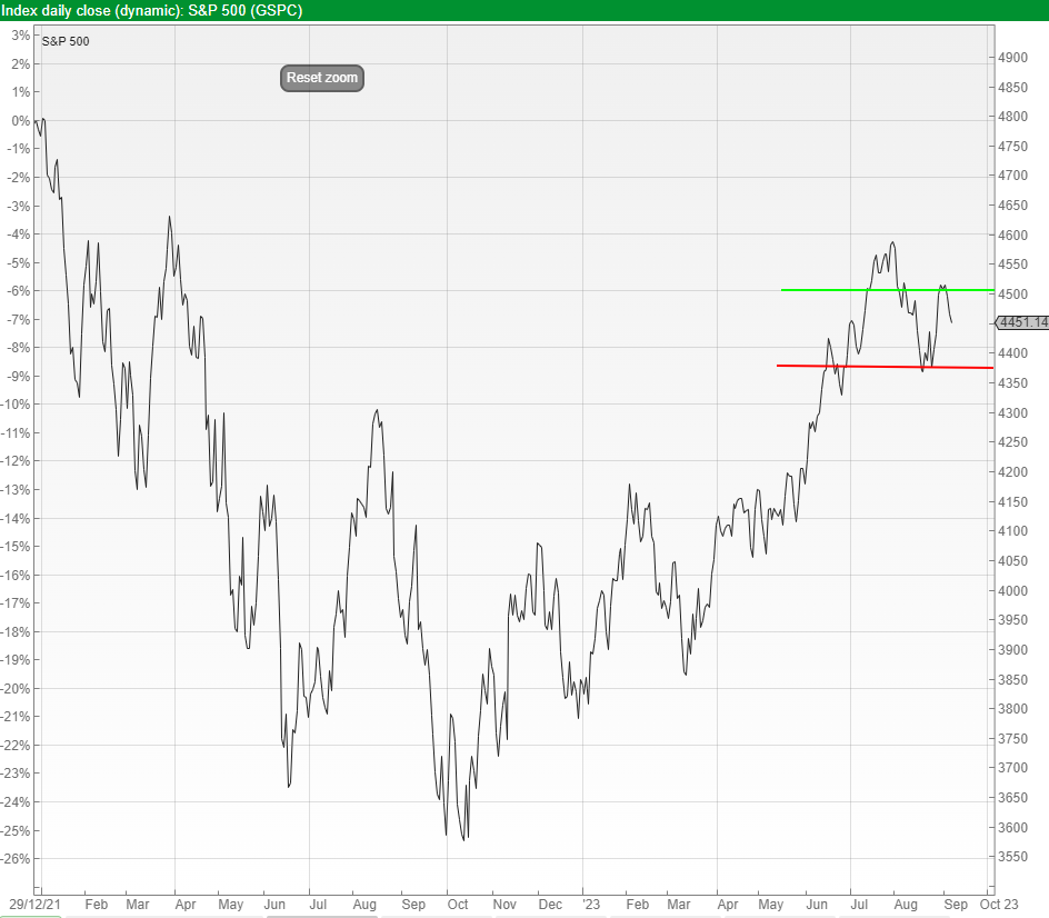
We certainly can’t ignore the pivotal US market, and the S&P 500 index is shown in Chart 3 below.
This index sits firmly between the lower support line (red line at 4360) and the higher line of resistance (green line at 4510). If the index rises 1.3% from today, we should expect a new peak as it breaches the green line.
On the other hand, if it falls 2% it is likely heading much lower, and the analysis remains intact of a conventional peak on 3rd January 2022.
Chart 3: S&P 500 Since 3rd January 2022 Peak
Lastly China. This has been covered on a few occasions in recent teleconferences. Chart 4 shows the Chinese stock market since the 2007 peak (yes, 2007). Our analysis was that the October 2022 trough was important, and that from that point China was a long term “buy”.
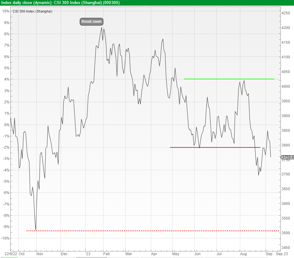
In Chart 5 is a close up of the action since October 2022, that line shown by the red dotted line – if this line is breached, our positive analysis was wrong, and we must wait for another clear entry point.
Also on Chart 5, the red line is where we applied a Stop-Loss a few weeks ago. A bounce up through the green line (at 4020) will re-instate the positive outlook.
Chart 4: CSI 300 Since 2007 Peak
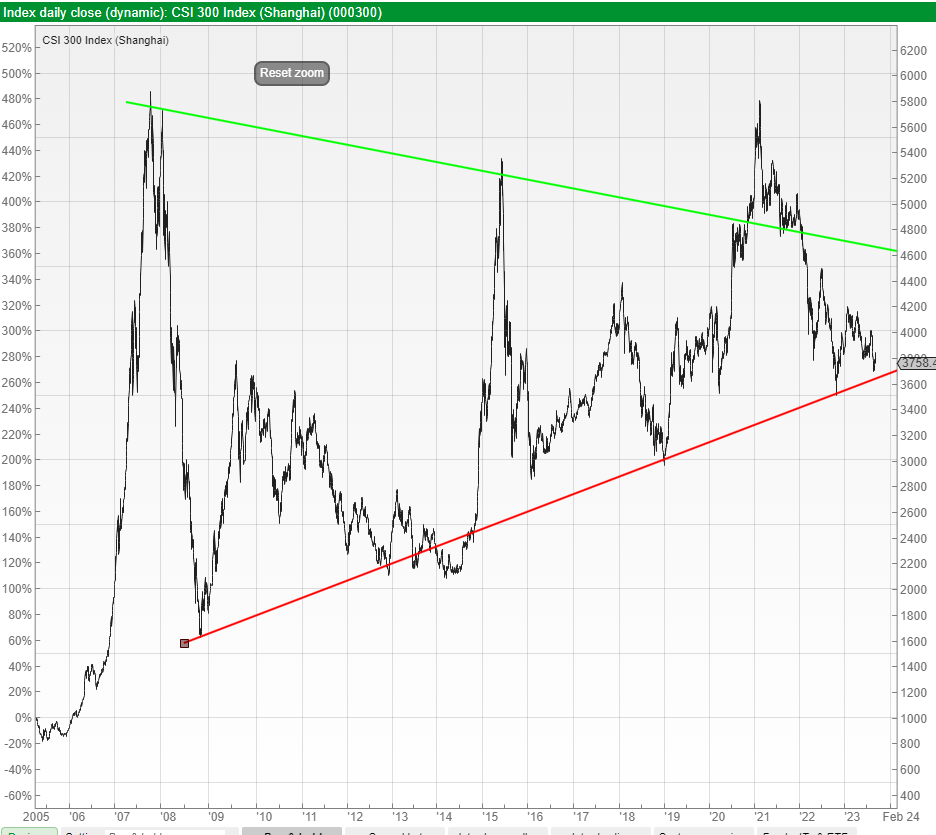
Chart 5: CSI 300 Since October 2022 Low
It is unusual to have such a clear range of charts at any one time, using nothing more than a pencil and a ruler to identify clear support and resistance levels. We will update these in the next teleconference.