.png) The Trump election was a shock for many, but initially the market liked the idea – less tax, less regulation, big infrastructure spend etc. Here is the story in charts.
The Trump election was a shock for many, but initially the market liked the idea – less tax, less regulation, big infrastructure spend etc. Here is the story in charts.
The Trump Jump can clearly be seen in chart 1 (red line) reflecting his first 6 months in office. In contrast, China and wider Asia notably struggled. This soon changed. (Note I use the indices for the UK and US and the sector averages for the other areas).
Chart 1 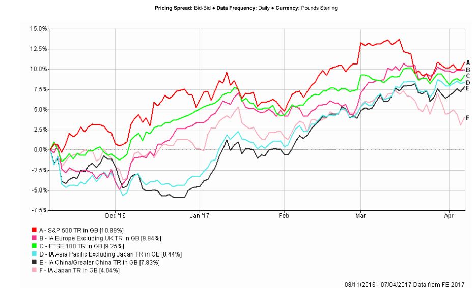
In chart 2 you can see that as the New Year dawned China went on a roll which continues to this day (the black line). Momentum in the US market (S&P 500) stalled in the spring, and has only laterally gathered a bit more momentum.
Whether or not the US can continue to make progress is open to considerable doubt, with valuations now being a huge barrier combined with rates going up and QE going into reverse.
China does not have such problems – whether valuations, economic or political. HERE is a short update based on research we had in the last week.
On this chart you can also see that Asia excl Japan has broken up sharply in the last couple of months (green line) mirroring China.
Chart 2 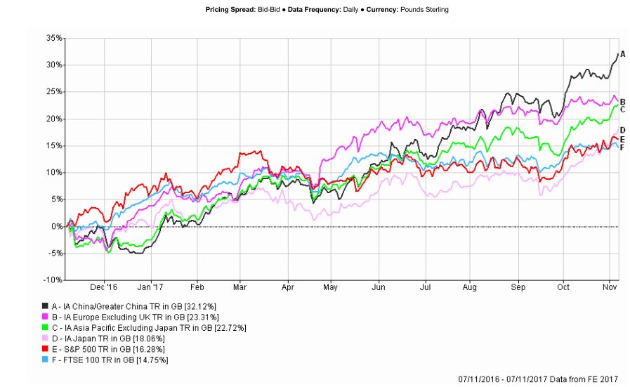
A word of warning
We must be careful not to become (emotionally) wedded to the East is good, West is bad – even though it has been very profitable for some time. For no other reason than that at some point the worm will turn. That is why we use the (unemotional) momentum measure as our primary investing tool. The Dynamic Global Portfolio and Dynamic World ex-UK Portfolio are designed to stop us staying too long in a state idea.
ACTION FOR INVESTORS
- Don't get blinded by the East is good, West is bad narrative...
- ...although it has been profitable.
- A process is your insurance against turbulent times and changing trends.
FURTHER READING